Latent Geometry II
atent geometry is intuition design. Human bodies are always present in architecture. "Architecture is an extension of the human body", L5 Design's slogan, refers to what shapes a human body and our structures are the same: geometric shapes and forms. Structures, however, assume that all humans have use of all parts, of an average body, that is. Since 2000, design has changed to included people with disabilities. In the US, it was the Americans with Disabilities Act signed in by George H.W. Bush in 1990. I visited Japan in 1984 and they were already accommodating their people with challenges.
'Latent Geometry" from The Beautiful Necessity by Claude F. Bragdon
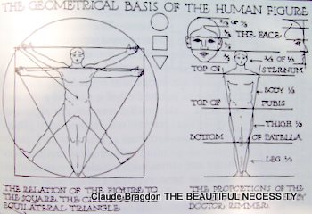
[Illustration 45: THE GEOMETRICAL BASIS OF THE HUMAN FIGURE
The plane figures principally employed in determining architectural proportion are the circle, the equilateral triangle, and the square--which also yields the right angled isosceles triangle. It will be noted that these are the two dimensional correlatives of the sphere, the tetrahedron and the cube, men-tioned as being among the determining forms in molecular structure. The question naturally arises, why the circle, the equilateral triangle and the square? Because, aside from the fact that they are of all plane figures the
most elementary, they are intimately related to the body of man, as has been shown
and the body of man is as it were the architectural archetype. But this simply removes the inquiry to a different field, it is not an answer. Why is the body of man so constructed and related? This leads us, as does every question, to
the threshold of a mystery upon which theosophy alone is able to throw light. Any extended elucidation would be out of place here: it is sufficient to remind the reader that the circle is the symbol of the universe; the equilateral tri-angle, of the higher trinity (_atma, buddhi, manas_); and the square, of the lower quaternary of man's sevenfold nature.
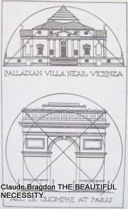
Illustration 59
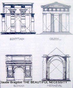
Illustration 60
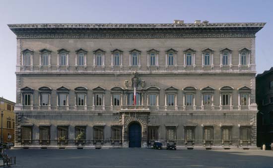
The square is principally used in preliminary plotting: it is the determining figure in many of the palaces of the Italian Renaissance; the Arc de Triomphe, in Paris is a modern example of its use (Illustrations 59, 60). The circle is often employed in conjunction with the square and the triangle. In Thomas Jefferson's Rotunda for the University of Virginia, a single great circle was the determining figure, as his original pen sketch of the building shows (Illustration 61).
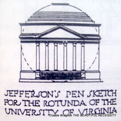
Illustration 61
Some of the best Roman triumphal arches submit themselves to a circular synopsis, and a system of double intersecting circles has been applied, with interesting results, to facades as widely different as those of the Parthenon and the Farnese Palace in Rome, though it would be fatuous to claim that these figures determined the proportions of the facades.
Farnese Palace, Rome
By far the most important figure in architectural proportion, considered from the standpoint of geometry, is the equilateral triangle. It would seem that the eye has an especial fondness for this figure, just as the ear has for certain related sounds. Indeed it might not be too fanciful to assert that the common chord of any key (the tonic with its third and fifth) is the musical equivalent of
the equilateral triangle. It is scarcely necessary to dwell upon the properties and unique perfection of this figure. Of all regular polygons it is the simplest: its three equal sides subtend equal angles, each of 60 degrees; it trisects the circumference of a circle; it is the graphic symbol of the number three, and hence of ever threefold thing; doubled, its generating arcs form the _vesica
piscis_, of so frequent occurrence in early Christian art; two symmetrically intersecting equilateral triangles yield the figure known as "Solomon's Seal," or the "Shield of David," to which mystic properties have always been ascribed.
It may be stated as a general rule that whenever three important points in any architectural composition coincide (approximately or exactly) with the three extremities of an equilateral triangle, it makes for beauty of proportion. An ancient and notable example occurs in the pyramids of Egypt, the sides of which, in their original condition, are believed to have been equilateral triangles. It is a demonstrable fact that certain geometrical intersections yield the important proportions of Greek architecture. The perfect little Erechtheum would seem to have been proportioned by means of the equilateral triangle and the angle of 60 degrees, both in general and in detail. (Illustration 62 - Application of the Equilateral Triangle to the Erectheum-at Athens)
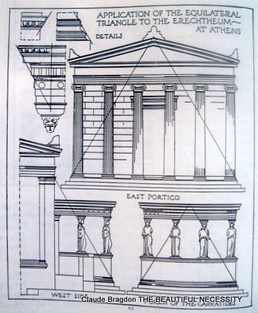
Illustration 62
The same angle, erected from the central axis of a column at the point where it intersects the architrave, determines both the projection of the cornice and the height of the architrave in many of the finest Greek and Roman temples.
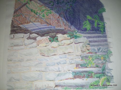
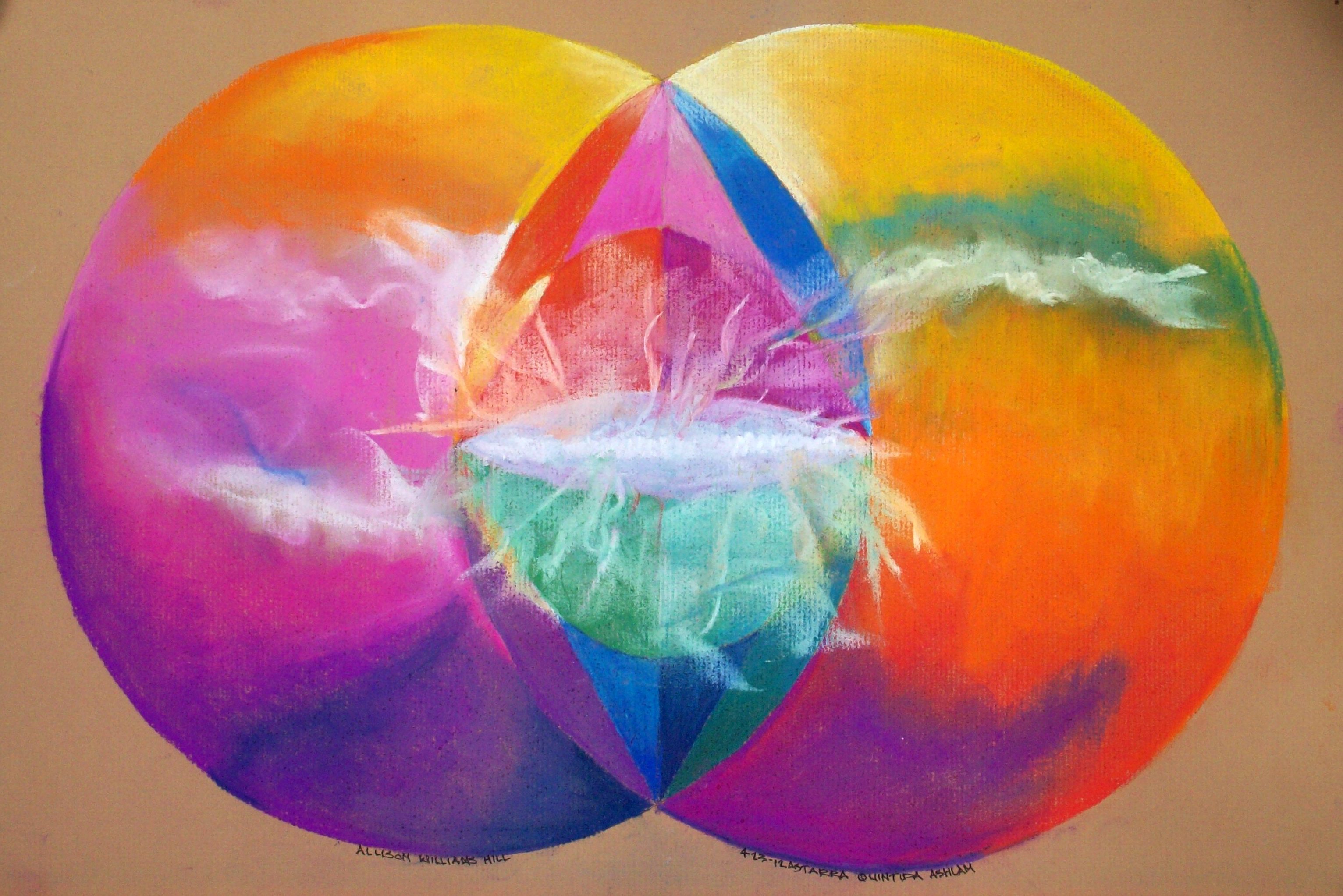
Promise by Allison L. Williams Hill
The equilateral triangle used in conjunction with the circle and the square was employed by the Romans in determining the proportions of triumphal arches, basilicas and baths. That the same figure was a factor in the designing of Gothic cathedrals is sufficiently indicated in the accompanying facsimile reproductions of an illustration from the Como Vitruvius, published in Milan in 1521, which shows a vertical section of the Milan cathedral and the system of equilateral triangles which determined its various parts.
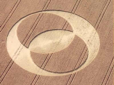
Vesica Piscis Crop Circle
The vesica piscis was often used to establish the two main internal dimen-sions of the cathedral plan: the greatest diameter of the figure corresponding with the width across the transepts, the upper apex marking the limit of the apse, and the lower, the termination of the nave. Such a proportion is seen to be both subtle and simple, and possesses the advantage of being easily laid out. The architects of the Italian Renaissance doubtless inherited certain of the Roman canons of architectural proportion, for they seem very generally to have recognized them as an essential principle of design.
Nevertheless, when all is said, it is easy to exaggerate the importance of this matter of geometrical proportion. The designer who seeks the ultimate secret of architectural harmony in mathematics rather than in the trained eye, is following the wrong road to success. A happy inspiration is worth all the formulae in the world--if it be really happy, the artist will probably find that he has "followed the rules without knowing them." Even while formulating con-cepts of art, the author must reiterate Schopenhauer's dictum that the _concept_ is unfruitful in art. The mathematical analysis of spatial beauty is an interesting study, and a useful one to the artist; but it can never take the place of the creative faculty, it can only supplement, restrain, direct it. The study of proportion is to the architect what the study of harmony is to a musician--it helps his genius adequately to express itself.
Links

